Home›Latest Updates
-
Flex groups are a form of tab headers that have been integrated into the Tab component module. Built with CSS+HTML, they can be used anywhere in the webpage body and may also be packaged/referenced by other custom components or modules.
-
Tab groups are a form of tab headers that have been integrated into the Tab component module. Built with CSS+HTML, they can be used anywhere in the webpage body and may also be packaged/referenced by other custom components or modules.
-
Multi-criteria filtering allows intuitive condition combination through point-and-click selection. Purely CSS-implemented, users can extend functionality as needed. Suitable for listing pages on classified information websites.
-
Increase or decrease the font size, line height, and margin sizes of the page using the num-step and fs-root variables
-
Displays the CSS animations integrated in this framework, including transition animations and keyframe animations, which can meet daily usage needs.
-
Use _r[-*] style classes to independently set an element's border radius, supporting customization of size and position. The sizing is based on a 3px increment (e.g., _r-3 means 3px*3).
-
The FILE custom tag is an encapsulation of the native file tag. In addition to maintaining the functionality of single and multiple file selection, it also adds support for a toolbox, file quantity limit prompts, and quantity validation.
-
The upload module supports batch uploading in multiple formats, with direct cloud transmission to Amazon S3, Cloud Storage, Azure Blob Storage, OSS, COS, Kodo, UPYUN and other cloud services.
-
The Accordion component can create nested collapsible panels and supports multiple data formats.
-
The Accordion component can create nested collapsible panels and supports multiple data formats.
-
 The OC-BTN custom component represents a button. As one of the most fundamental web elements, this button component supports multiple child elements including prefixes, suffixes, icons, and images. It offers various size options, structural styles, a...
 -
 A badge is typically displayed in a floating manner at one of the four corners of an element. The flag component is used to define a badge, supporting three badge styles and multiple theme colors.
 -
 The like component is typically used at the end of an article, allowing users to show their support by liking it. While its functionality is singular, it supports rich sub-elements including like counts, icons, labels, and tooltips.
 -
The category component is used to create section titles. It can be used for large sections on a page or small sections in a sidebar, serving to separate adjacent sections and indicate the main content of the current section.
-
While native HTML tags provide basic text formatting, certain special text formats still require custom CSS or JavaScript implementations. The format component currently supports several specialized text formats, including pinyin annotations, line br...
-
 The status indicator displays system states, such as: new messages in current tasks, section notifications, error alerts, or warning prompts in content blocks.
 -
 The step component can implement both historical progress trackers and operational progress indicators in step-bar format.
 -
The step component can implement both historical progress trackers and operational progress indicators in step-bar format.
-
 The AVATAR tag can create both image-based avatars and text-based avatar placeholders. It supports attributes including theme, tips, size, and shape for customization.
 -
 The BADGE custom tag can create a small colored bubble to store the implied quantity of information for an element. If the badge has no value, it will be displayed directly as a dot red dot.
 -
 A buoy float is typically used to display small statistical data. Though compact in size, it includes all essential elements such as value, label, icon, arrow, and tips—truly embodying the idea of 'small but complete.'
 -
 The result component is the final evolved form of a buffer. It can display four types of outcomes: info, success, error, and warning, presented either as SVG animations or static icons.
 -
The stats component primarily highlights numerical values and can be enriched with properties like icon, disk, tips, and unit to enhance its content. It supports common operations such as reset and set.
-
 The PROGRESS component is a WebComponent implementation based on the Progress module. Compared to the original module, it offers simpler usage without initialization requirements, making it ideal for project integration. It supports multiple variants...
 -
The PROGRESS component is a WebComponent implementation based on the Progress module. Compared to the original module, it offers simpler usage without initialization requirements, making it ideal for project integration. It supports multiple variants...
-
 The callout component can convey: notifications, announcements, alerts, warnings, notices, and other informational messages. It serves as a replacement for alert and notice components.
 -
The callout component can convey: notifications, announcements, alerts, warnings, notices, and other informational messages. It serves as a replacement for alert and notice components.
-
The icon component is primarily used to display an icon. The form of the icon is not limited to iconfont icon fonts; it can also be images such as SVG, PNG, or JPG. It supports theme color themes and the use of label text, as well as various mixed st...
-
The pill component is a standalone tab-switching component that only includes the tab header (not the tab body). It resembles a capsule shape and features an animated moving background block.
-
The pill component is a standalone tab-switching component that only includes the tab header (not the tab body). It resembles a capsule shape and features an animated moving background block.
-
 The twilight component enables global dark mode switching for the entire page, and also supports localized dark mode toggling.
 -
 The checkbox is one of the most common form fields, supporting multiple attributes and basic operations like reset, set, clear, and check. It also supports data caching and validation.
 -
The checkbox is one of the most common form fields, supporting multiple attributes and basic operations like reset, set, clear, and check. It also supports data caching and validation.
-
 The checkboxes component allows creating multiple checkbox form fields at once and supports batch checked operations.
 -
The checkboxes component allows creating multiple checkbox form fields at once and supports batch checked operations.
-
 The radio component is an enhanced wrapper for native input[type=radio], supporting three states: check, checking and checked. It offers multiple sizes to fit different form layouts, supports data caching and form validation, accommodates chera-style...
 -
The radio component is an enhanced wrapper for native input[type=radio], supporting three states: check, checking and checked. It offers multiple sizes to fit different form layouts, supports data caching and form validation, accommodates chera-style...
-
 The radios component allows creating multiple radio form fields at once and supports batch checked operations.
 -
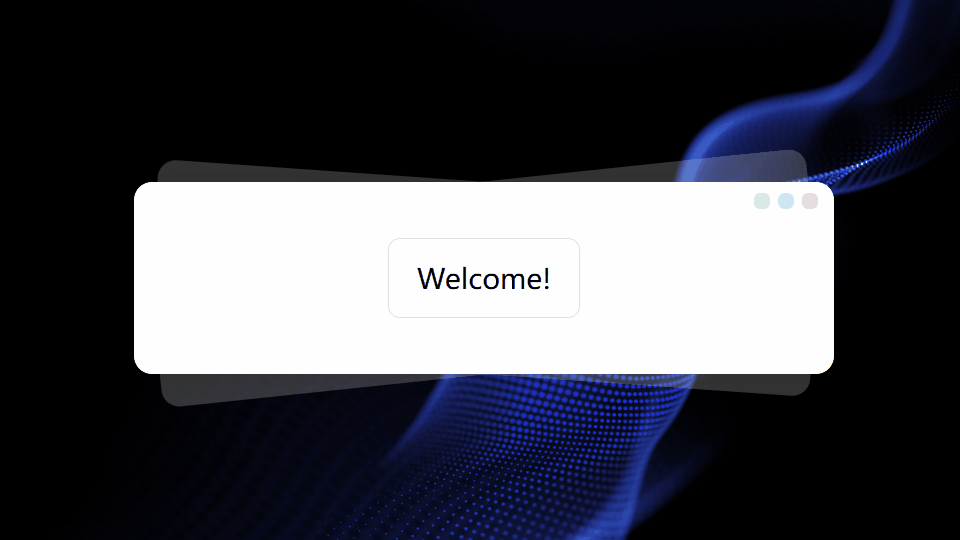
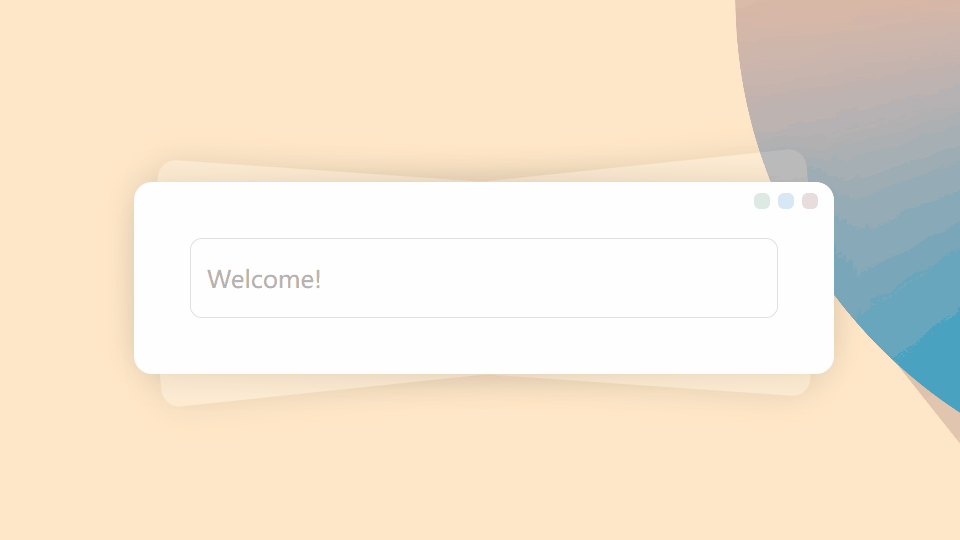 The INPUT custom component is an enhanced wrapper of the native input element. While maintaining single-line text input functionality, it additionally provides toolbox features, character limit indicators, and input validation support.
 -
The INPUT custom component is an enhanced wrapper of the native input element. While maintaining single-line text input functionality, it additionally provides toolbox features, character limit indicators, and input validation support.