-
 The search component implements common search form fields, supports nesting various custom form fields, and features autocomplete functionality.
 -
 The Rate component provides star-based rating functionality with half-star precision and full customization of rating icons/images.
 -
The Rate component enables star-based rating systems with half-star precision and supports custom icons/images for flexible visual styling.
-
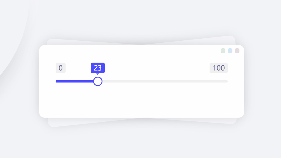 The range component supports both single and dual thumb sliders with freeze functionality and scale markers, serving as an enhanced replacement for native HTML range inputs.
 -
The Range module supports both single and dual slider selection with freeze functionality and ruler markers, providing a perfect replacement for native range components.
-
 The radios component allows creating multiple radio form fields at once and supports batch checked operations.
 -
 The radio component is an enhanced wrapper for native input[type=radio], supporting three states: check, checking and checked. It offers multiple sizes to fit different form layouts, supports data caching and form validation, accommodates chera-style...
 -
 The number input component differs from the text input component in that it only accepts numerical values. Its usage is the same as a form field with type='number', with identical attributes including min, max, step, etc. It supports validation, cach...
 -
 The INPUT custom component is an enhanced wrapper of the native input element. While maintaining single-line text input functionality, it additionally provides toolbox features, character limit indicators, and input validation support.
 -
 The checkboxes component allows creating multiple checkbox form fields at once and supports batch checked operations.
 -
 The checkbox is one of the most common form fields, supporting multiple attributes and basic operations like reset, set, clear, and check. It also supports data caching and validation.
 -
A form field container is the basic unit that makes up a complete form. Within a form field container, child elements may include native elements like input, custom form field components, form validation modules, a left-side label header, right-side ...
-
Single-line form field combination component that groups multiple form fields into a unified whole
-
The Editor rich text editor component supports HTML editing (unlike textarea which only handles plain text) and provides multiple shortcut operations.
-
The Editor rich text editor supports HTML editing, unlike textarea which only handles plain text, and provides multiple shortcut operations.
-
The upload component supports batch uploading in multiple formats with direct cloud transmission, including Amazon S3, Cloud Storage, Azure Blob Storage, OSS, COS, Kodo, UPYUN and more.
-
The upload module supports batch uploading in multiple formats, with direct cloud transmission to Amazon S3, Cloud Storage, Azure Blob Storage, OSS, COS, Kodo, UPYUN and other cloud services.
-
The select component supports both single and multiple selection, perfectly replacing native select-single and select-multiple components; it features fuzzy search and auto-completion.
-
The Select module enables single and multiple selection, perfectly replacing the native select-single and select-multiple components; it supports fuzzy search and auto-completion.
-
The datetime component can create date picker instances, supporting single or multiple date selection, date range selection, lunar calendar usage, and custom events.
-
The Datetime module can create date picker instances, supporting single or multiple date selection, as well as date range selection. It also supports the use of lunar calendars and custom events.
-
The TEXTAREA component extends native textarea functionality with enhanced features including a toolbar, character limit indicators, and built-in input validation.
-
The Valid validation module performs value validation on form fields. It requires the form field to have a 'name' attribute and is best used within a 'form' node. When submitting the form, 'validate' supports secondary validation. It also supports as...
-
The FILE custom tag is an encapsulation of the native file tag. In addition to maintaining the functionality of single and multiple file selection, it also adds support for a toolbox, file quantity limit prompts, and quantity validation.