Home›Docs
-
 The twilight component enables global dark mode switching for the entire page, and also supports localized dark mode toggling.
 -
 The step component can implement both historical progress trackers and operational progress indicators in step-bar format.
 -
 The status indicator displays system states, such as: new messages in current tasks, section notifications, error alerts, or warning prompts in content blocks.
 -
 SPIN is a static buffer, indicating that data or resources are being loaded, prompting the user to wait; this buffer supports multi-subject colors and dark mode inversion.
 -
 The search component implements common search form fields, supports nesting various custom form fields, and features autocomplete functionality.
 -
 The result component is the final evolved form of a buffer. It can display four types of outcomes: info, success, error, and warning, presented either as SVG animations or static icons.
 -
 The Rate component provides star-based rating functionality with half-star precision and full customization of rating icons/images.
 -
The Rate component enables star-based rating systems with half-star precision and supports custom icons/images for flexible visual styling.
-
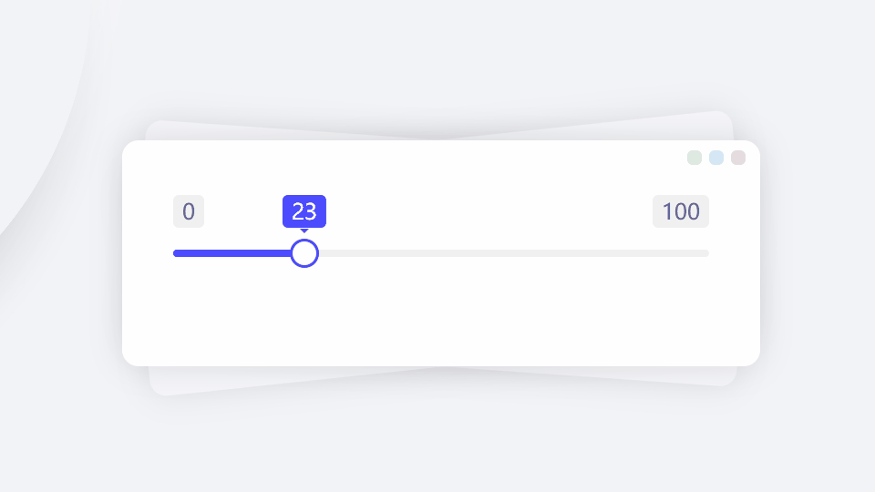 The range component supports both single and dual thumb sliders with freeze functionality and scale markers, serving as an enhanced replacement for native HTML range inputs.
 -
The Range module supports both single and dual slider selection with freeze functionality and ruler markers, providing a perfect replacement for native range components.
-
 The radios component allows creating multiple radio form fields at once and supports batch checked operations.
 -
 The radio component is an enhanced wrapper for native input[type=radio], supporting three states: check, checking and checked. It offers multiple sizes to fit different form layouts, supports data caching and form validation, accommodates chera-style...
 -
 The PROGRESS component is a WebComponent implementation based on the Progress module. Compared to the original module, it offers simpler usage without initialization requirements, making it ideal for project integration. It supports multiple variants...
 -
 Pagination is not packaged as a component because different systems use pagination in various ways. Designing pagination with native HTML and CSS allows flexible combination of pagination elements for different scenarios. These elements include 'prev...
 -
 The number input component differs from the text input component in that it only accepts numerical values. Its usage is the same as a form field with type='number', with identical attributes including min, max, step, etc. It supports validation, cach...
 -
 The INPUT custom component is an enhanced wrapper of the native input element. While maintaining single-line text input functionality, it additionally provides toolbox features, character limit indicators, and input validation support.
 -
 The like component is typically used at the end of an article, allowing users to show their support by liking it. While its functionality is singular, it supports rich sub-elements including like counts, icons, labels, and tooltips.
 -
 A badge is typically displayed in a floating manner at one of the four corners of an element. The flag component is used to define a badge, supporting three badge styles and multiple theme colors.
 -
 The deform morphing button component can switch between multiple expression forms, such as transforming from a menu button to a close button. It supports info, menu, add, close, left, right, up, down, menuStart, and menuEnd form types, with multiple ...
 -
 The checkboxes component allows creating multiple checkbox form fields at once and supports batch checked operations.
 -
 The checkbox is one of the most common form fields, supporting multiple attributes and basic operations like reset, set, clear, and check. It also supports data caching and validation.
 -
 The callout component can convey: notifications, announcements, alerts, warnings, notices, and other informational messages. It serves as a replacement for alert and notice components.
 -
 A buoy float is typically used to display small statistical data. Though compact in size, it includes all essential elements such as value, label, icon, arrow, and tips—truly embodying the idea of 'small but complete.'
 -
 The OC-BTN custom component represents a button. As one of the most fundamental web elements, this button component supports multiple child elements including prefixes, suffixes, icons, and images. It offers various size options, structural styles, a...
 -
 The BADGE custom tag can create a small colored bubble to store the implied quantity of information for an element. If the badge has no value, it will be displayed directly as a dot red dot.
 -
 The AVATAR tag can create both image-based avatars and text-based avatar placeholders. It supports attributes including theme, tips, size, and shape for customization.
 -
 ALARM alerts are typically used to locate and display warning events, providing conspicuous warnings or notifications. This alert component supports displaying icons, text, and images, with three halo diffusion sizes available.
 -
The Accordion library can create nested collapsible panels and supports multiple data formats.
-
A short real-time message that disappears automatically and cannot be clicked or copied
-
The Viewer media viewer supports full-screen viewing of multimedia files, including images, videos, audio, maps, iframes, and other embeddable platform links.
-
The Gesture library is a multi-device gesture module dedicated to OrcaUI. It standardizes events such as click (single tap), dblclick (double tap), hold (long press), cancel, scale (pinch zoom), rotate, and translate (pan). It also specifically handl...
-
The Swipe module is a carousel and rotating banner module that enables the cyclic display of media content such as text, images, videos, and iframes. It supports drag-and-drop scrolling as well as button-click slider switching. It also supports async...
-
A form field container is the basic unit that makes up a complete form. Within a form field container, child elements may include native elements like input, custom form field components, form validation modules, a left-side label header, right-side ...
-
Single-line form field combination component that groups multiple form fields into a unified whole
-
The Editor rich text editor component supports HTML editing (unlike textarea which only handles plain text) and provides multiple shortcut operations.
-
The Editor rich text editor supports HTML editing, unlike textarea which only handles plain text, and provides multiple shortcut operations.
-
The upload component supports batch uploading in multiple formats with direct cloud transmission, including Amazon S3, Cloud Storage, Azure Blob Storage, OSS, COS, Kodo, UPYUN and more.
-
The upload module supports batch uploading in multiple formats, with direct cloud transmission to Amazon S3, Cloud Storage, Azure Blob Storage, OSS, COS, Kodo, UPYUN and other cloud services.
-
The select component supports both single and multiple selection, perfectly replacing native select-single and select-multiple components; it features fuzzy search and auto-completion.
-
The Select module enables single and multiple selection, perfectly replacing the native select-single and select-multiple components; it supports fuzzy search and auto-completion.