Range Component
Category: FormThe range component supports both single and dual thumb sliders with freeze functionality and scale markers, serving as an enhanced replacement for native HTML range inputs.
Preface
The range component is based on the Range library and supports all parameters from the module. This component requires no initialization - it can be used directly by inserting it as HTML into the page.
Basic Usage
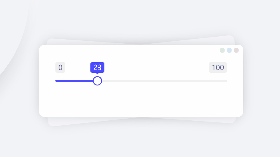
Insert the custom component oc-range to create a single-thumb slider selector with a default range of 0~100.
- Output
- HTML
Initial Value
The initial value can be set in the value attribute or written inside the tag.
- Output
- HTML
-
40 -
Increment and Decrement
To display increment/decrement buttons, set the attribute button.
- Output
- HTML
Dual Sliders
There are three ways to create dual sliders:
- Set the
multipleattribute - Set initial value with numbers separated by tilde
~, e.g.value="20~40" - Write two values inside the tag separated by tilde
~
Note: The separator can be customized via the separator attribute, but using - is not recommended as it may be interpreted as a minus sign for subtraction between the two values.
- Output
- HTML
-
20~60 -
Range Constraints
To further constrain the range within the original min/max values, use the fence property, which is an object with the following properties:
- enable: Whether to enable (default: false)
- min: Minimum value (default: same as min parameter)
- max: Maximum value (default: same as max parameter)
- Output
- HTML
Disabling
Set the attribute disabled to disable the slider.
- Output
- HTML
Attributes
This component encapsulates the built-in instance, and its attributes are consistent with the parameters of the built-in instance. You can click here to view all parameters.
Several important notes:
- All component attributes should be lowercase.
- Attribute values must be in string format.
- If an attribute value is an object, the surrounding
{and}symbols can be omitted. - For attribute names that are verb-object structures or composed of two words, use hyphens to separate them. For example:
- Module parameter
contType(if exists) should be written ascont-typein component attributes - Parameter
b4Initshould be written asb4-initin attributes
- Module parameter
- All methods, events, and variables can be accessed through the built-in instance (typically via
this.ins). - When data cannot be passed through component attributes (e.g., due to nested single/double quote issues), you can manipulate the built-in instance to achieve your goal. It's particularly recommended to implement event listeners through the built-in instance.
Common Methods
Common component methods:
set: Set properties (takes key-value pairs or array)reset: Reset properties (no params)clear: Clear properties and values (no params)
Basic usage: CompElem.reset()
Common Events
Common component events:
connected: Component connected (no params)disconnected: Component disconnected (no params)adopted: Component moved (no params)set: Property set (receives value)cleared: Property cleared (no params)reset: Property reset (no params)
Basic usage: CompElem.on('connected',()=>{console.log('connected')})