Range Library
Category: FormThe Range module supports both single and dual slider selection with freeze functionality and ruler markers, providing a perfect replacement for native range components.
Preface
The range library is a foundational library used to output a range value and serves as the base for the oc-range component.
This library supports the following features:
- Initialization with either input nodes or div nodes
- Support for increment/decrement via buttons
- Real-time display of sliding results
- Support for keyboard arrow key controls
- Display of ruler markers with two-level scales
- Secondary range constraints within min/max bounds
- Support for enable/disable functionality
- Bubble indicator display
- Customizable major scale text content
- Click-to-position on the track
- Dual-handle range value display
- Draggable range track for equal-value translation
- Click positioning via min/max bubbles and major scale text
- Customizable scale divisions including secondary scale divisions
- Support for both horizontal and vertical slider orientations
Basic Usage
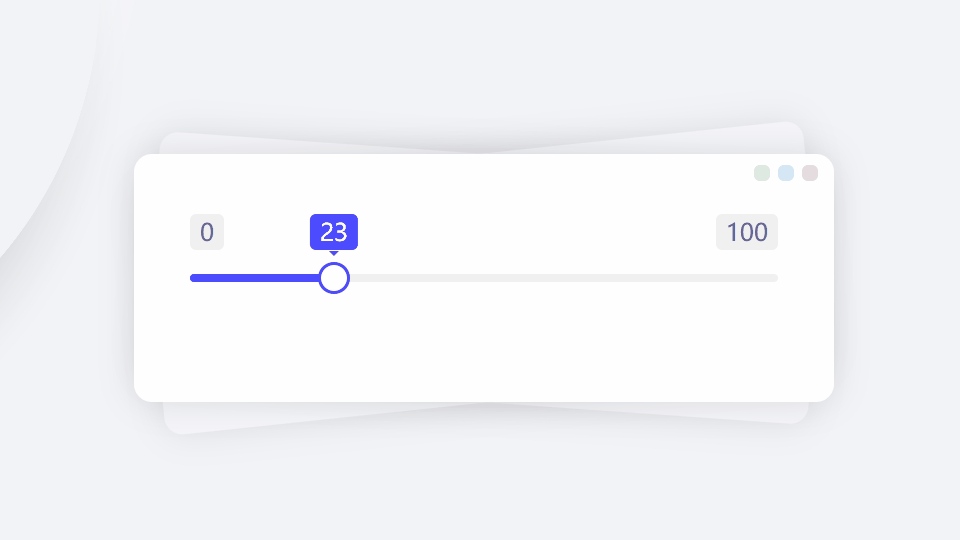
Apply the oc-range attribute to a div or input node to create a standard 0~100 range slider.
- Output
- HTML
You can also create range sliders using the id+new pattern.
- Output
- HTML
- JS
-
-
-
new orca.Range('#demo')
Increment and Decrement
To display increment/decrement buttons, set the parameter button:true or button.enable:true.
- Output
- HTML
The button parameter is an object with the following properties:
- enable: Whether to enable (default: false)
- step: Step value (default: 1, same as the step parameter)
- decrease: HTML content for decrement button (default: minus icon)
- increase: HTML content for increment button (default: plus icon)
- Output
- HTML
Dual Sliders
To enable dual sliders, set the parameter multiple:true.
- Output
- HTML
Range Constraints
To further constrain the range within the original min/max values, use the fence property, which is an object with the following properties:
- enable: Whether to enable (default: false)
- min: Minimum value (default: same as min parameter)
- max: Maximum value (default: same as max parameter)
- Output
- HTML
Sizing
Set the size using the size parameter, which supports three values: sm, md, and lg:
- sm: Height 32px (3.2rem), track 3px
- md: Height 40px (4.0rem), track 5px
- lg: Height 56px (5.6rem), track 14px
- Output
- HTML
Disabling
Set the parameter disabled:true to disable the slider.
- Output
- HTML
Basic Configuration
| Property | Type | Default | Description |
|---|---|---|---|
| name | string | '' | Hidden input name attribute |
| step | number | 1 | Slider step value |
| max | number | 100 | Maximum value |
| min | number | 0 | Minimum value |
| value | number/array | 0 | Initial value |
| dir | 'h'/'v' | 'h' | Slider direction |
| disabled | boolean | false | Whether disabled |
Display Configuration
| Property | Type | Default | Description |
|---|---|---|---|
| size | 'sm'/'md'/'lg' | 'md' | Slider size |
| full | boolean | false | Whether to span full width |
| classes | string | '' | Additional CSS classes |
| limitShow | boolean | true | Whether to show limit value bubbles |
| tipShow | boolean | true | Whether to show slider bubble |
Multi-Slider Configuration
| Property | Type | Default | Description |
|---|---|---|---|
| multiple | boolean | false | Whether to enable dual sliders |
| locked | boolean | false | Whether to lock slider spacing |
| separator | string | '~' | Input value separator |
| hyphen | string | '~' | Bubble value connector |
Range Configuration
| Property | Type | Default | Description |
|---|---|---|---|
| fence.enable | boolean | false | Whether to enable valid range |
| fence.min | number | 0 | Valid range minimum |
| fence.max | number | 100 | Valid range maximum |
Button Configuration
| Property | Type | Default | Description |
|---|---|---|---|
| button.enable | boolean | false | Whether to enable increment/decrement buttons |
| button.decrease | string | <i class="_icon-minus-o-f"></i> |
Decrease button HTML |
| button.increase | string | <i class="_icon-plus-o-f"></i> |
Increase button HTML |
| keyboard | boolean | false | Whether to support keyboard operation |
Ruler Configuration
| Property | Type | Default | Description |
|---|---|---|---|
| ruler.enable | boolean | false | Whether to show ruler |
| ruler.majorEqual | number | 4 | Major scale divisions |
| ruler.minorEqual | number/'auto' | 'auto' | Minor scale divisions |
| ruler.labels | array | [] | Major scale labels |
Result Display Configuration
| Property | Type | Default | Description |
|---|---|---|---|
| result.enable | boolean | false | Whether to show result |
| result.target | string/null | null | Result display container selector |
Callback Functions
| Property | Type | Default | Description |
|---|---|---|---|
| onSet | function | null | Callback after setting new value |
| onToStart | function | null | Callback when reaching minimum |
| onToEnd | function | null | Callback when reaching maximum |
| onEnabled | function | null | Callback after enabling |
| onDisabled | function | null | Callback after disabling |
| onRestored | function | null | Callback after restoring initial value |