Card Section
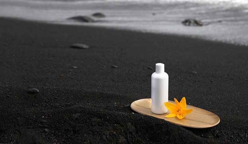
Category: ListThe card is used to display mixed content of images and text, in pure CSS form, and can be used with any layout, such as flex or grid.
Basic Structure
A card mainly consists of a cover image and main content, with the following basic HTML structure:
                        <div class="_card">
                            <a rep="poster">
                                <img/>
                            </a>
                            <div class="_card-body">
                                <div rep="title"></div>
                            </div>
                            <div class="_card-foot"></div>
                        <div>
Single Image with Text
Card lists are typically implemented using grid layout.
rep=posterindicates the cover image containerrep=titleindicates the title container- Both
rep=posternode and_card-footnode can be omitted
- Output
- HTML
Multiple Text with Image
In addition to rep=title, text blocks can also include rep=brief and rep=byline as needed. If the title needs ellipsis handling, use _ell related styles.
For single-line or multi-line text ellipsis usage, click here to view.
- Output
- HTML
-
-
 In 'Mija,' director Isabel Castro combined music documentaries with the style of 'Euphoria' and 'Clueless' to tell a more nuanced immigration story.362 September 22, 2022
 -
 The 63-year-old woman was seen working at the South Carolina store on Thursday. She was found dead Monday after her family reported her missing, authorities said.Keywords: BathroomTVIslands
 -
 Starring Keegan-Michael Key, Judy Greer and Johnny Knoxville, the Hulu show follows the revival of a fictional early 2000s sitcom.","authors":"Marina Fang and Candice FrederickKeywords: BathroomTVIslands
 -
 The Turks and Caicos Islands government imposed a curfew as the intensifying storm kept dropping copious rain over the Dominican Republic and Puerto Rico.Keywords: BathroomTVIslands
-
-
Custom Footer
The footer node only contains margin-top properties. If users need to customize footer content, they can place any elements inside _card-foot.
- Output
- HTML
-
-
The 63-year-old woman was seen working at the South Carolina store on Thursday. She was found dead Monday after her family reported her missing, authorities said.Keywords: BathroomTVIslands
I love traveling.
-
Starring Keegan-Michael Key, Judy Greer and Johnny Knoxville, the Hulu show follows the revival of a fictional early 2000s sitcom.","authors":"Marina Fang and Candice FrederickKeywords: BathroomTVIslandsTotal spent: 500 USD
Confirm
-
-
Using Tags
Since the cover image occupies a large area, you can place tags such as oc-flag, oc-badge and oc-bouy.
- Output
- HTML
-
-
NEW In 'Mija,' director Isabel Castro combined music documentaries with the style of 'Euphoria' and 'Clueless' to tell a more nuanced immigration story.362 September 22, 2022 -
NEW The 63-year-old woman was seen working at the South Carolina store on Thursday. She was found dead Monday after her family reported her missing, authorities said.Keywords: BathroomTVIslands -
BBC Starring Keegan-Michael Key, Judy Greer and Johnny Knoxville, the Hulu show follows the revival of a fictional early 2000s sitcom.","authors":"Marina Fang and Candice FrederickKeywords: BathroomTVIslands -
356 The Turks and Caicos Islands government imposed a curfew as the intensifying storm kept dropping copious rain over the Dominican Republic and Puerto Rico.Keywords: BathroomTVIslands
-
-
Using Buttons
Users can customize footer content or use built-in button group tags.
rep=btnsindicates button groups, wrapped by_card-footnode, aligned to the bottom of the card
Without Paddings
The list has padding and borders by default. We can remove borders to better integrate with other components.
Custom Image Ratio
The core of card is the large image. We can control the image ratio through CSS variable --_card-ar (ar=aspect-ratio). Default ratio is 16:9.
Multiple Images
Use rep=posters attribute tag to display image galleries. Place the photo wall component _wall inside the tag.